accenture
simplifying
team reviews
Teamboard is a dedicated dashboard for managers to quickly visualize team performance, monitor budget, and identify members who need attention.
Teamboard is a dedicated dashboard for managers to quickly visualize team performance, monitor budget, and identify members who need attention.
As part of their monthly tasks, managers at Accenture review numerous team members' performances. The HR department identified that the process was not efficient and took valuable time from the managers that could have been dedicated to clients. To solve the issue, they initiated a project to create a brand new tool that allows managers to gather data and review team members’ performance quickly.
UI Design
Axure, Figma
Internal Website
Each month, managers encountered inefficiencies in both system and process. The employee data lived in multiple Excel files, which managers had to coordinate and review. This proved tedious and also caused differences in process amongst individual managers. Finally, the Excel data was oftentimes out of date, leading to additional time spent verifying the accuracy of the data.
It was hard for managers to see an overall picture of their team performances in one place.
They couldn’t:
visualize accurate data
create groups to better organize their members
view their allocated budget
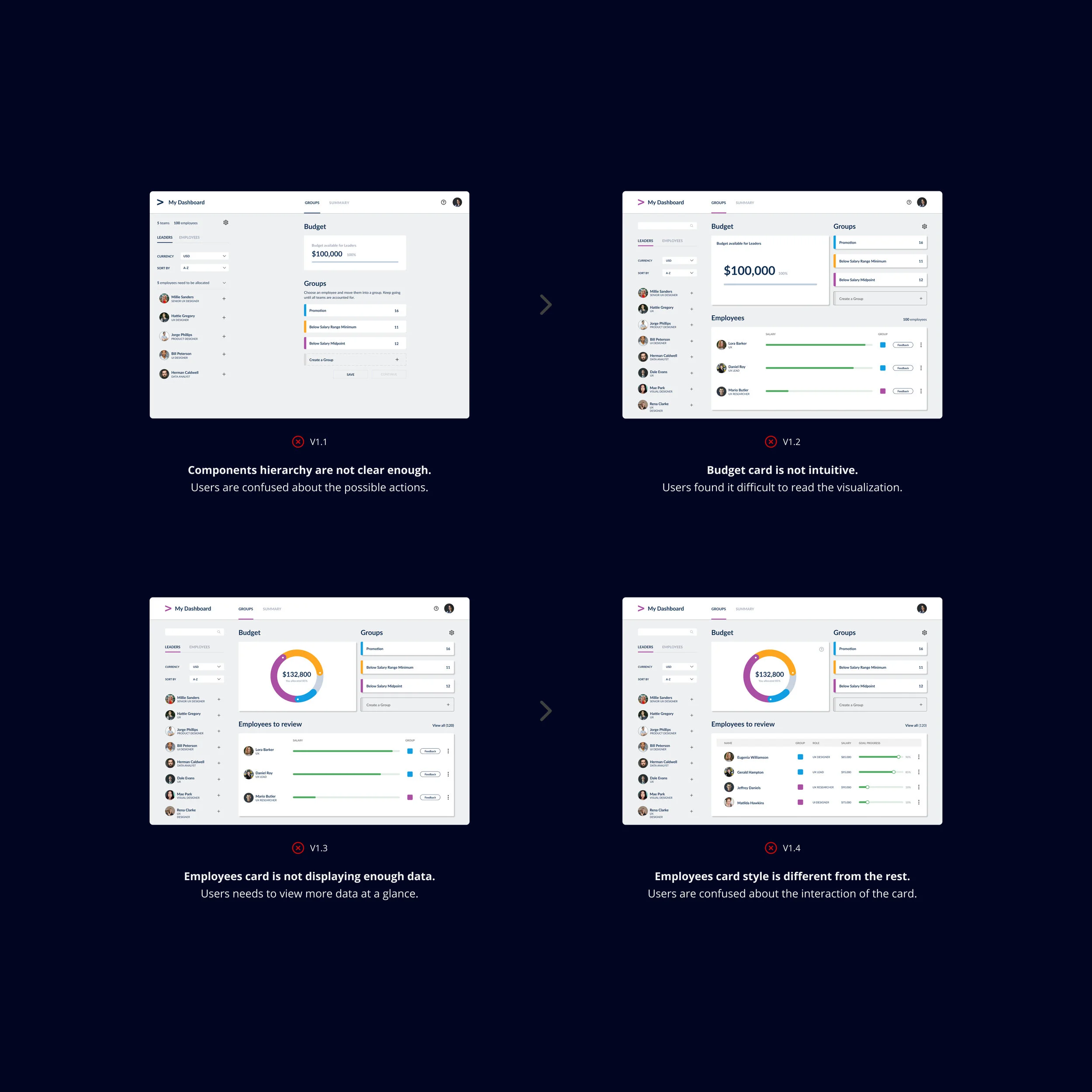
The first dashboard design implemented many features requested by the management. It didn’t necessarily follow specific design principles. Through user interviews, I learned how this first design helped the managers but also created major pain points in terms of UX.
Pros
Centralized information
Detailed employee profiles
Many available functions
Cons
Style not matching branding
Layout non-intuitive
Labels not clear enough

Confusing functions
The users were not familiar with the side navigation options.
Visualization not clear
The users found it difficult to read the information.

Dashboard design V1

Inconsistent visual elements
The users were introduced to elements different from other apps.

Low contrast
The users expressed difficulties to see the available actions.
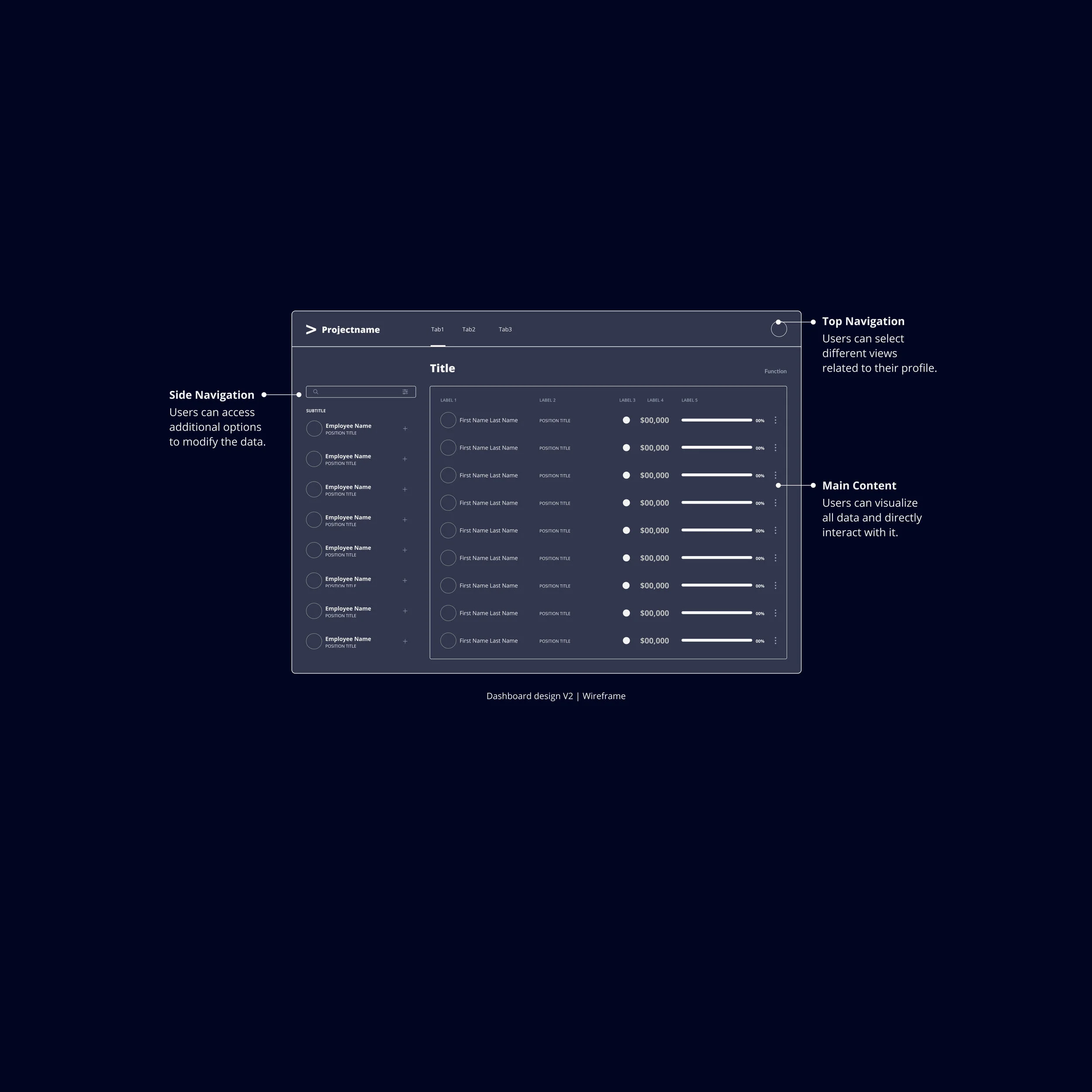
The prototype demonstrated how the managers could interact with each team member’s cards. The visualization of the budget and performances were the focal point. The tool was intentionally limited on functions to not distract the users.
When the dashboard was presented to stakeholders, the design resonated with them and sparked discussions around performance reviews. The ability to visualize performance data enabled them to open a broader, strategic conversation about how they measure employee performance. The interviews highlighted pain points specific to the displayed data:
Users can’t view detailed employee profile
Infographic isn’t easy to read
Profiles types are difficult to identify in the employee’s list view
I explored many versions to create the new dashboard. The design decisions were guided by principles focus on efficiency:
Approachable, all content, labels, and layout decisions need to clearly display their purpose so that the managers won’t need additional support to use the dashboard.
Minimal, the content has to be the main focus; if other elements aren’t primarily required for the managers then they’ll be added in a separate screen.
Based on the research learnings, I worked on revisiting the UX to remove all previous pain points cited in previous versions:
Optimizing the user flow to guide the managers to the data as quickly as possible. The users were able to access all data right after the login instead of going through 4 additional steps previously.

Revised user flow with all tabs available on the dashboard
Simplifying the navigation between screens by removing the requirement of finishing one step in order to move to the next tab.

Revised budget screen accessible directly via top navigation
Reorganizing the content and displaying the tabs by order of priority to let managers be able to view quickly data that needs their attention.

Revised summary screen allowing managers to access an overview of performances

Content focus
Be fully immersed in the information
to make the best decisions.

High readability
Identify quickly any critical data.

Intuitive layouts
Find all employees and
team data in one click.
The project was truly inspiring because the team didn’t settle for the existing process and challenged all members involved in the project to create this dashboard.
Besides some takeaways related to the core business of the teams, I learned important lessons I’ll be able to apply in future projects.
Details are as important as the final product
The users couldn’t necessarily point directly to the aspect that made the new dashboard easier to use; but when a function or a label was misplaced, the users expressed confusion and they were able to articulate more vividly what they were struggling with. This really illustrates the reason why today I always strive to elevate any project design through working on the details.
Design can be part of the strategy discussion
Before starting the project, the managers had vague ideas of what the ideal dashboard could look like. Through interviews and design iterations, this vision for the end results became clearer at the same time that concerns for strategy decisions surfaced. I realized then how much the design deliverables could support discussions affecting other teams.
Advocating for the best UX
The requirements list from the stakeholders didn’t take into consideration the overall UX. They were interested in hearing recommendations and guidance about how to prioritize and integrate the different dashboard features. From this experience, I now make a point to always demonstrate the importance of good UX in all projects I’m involved in.